Vyomi Seth
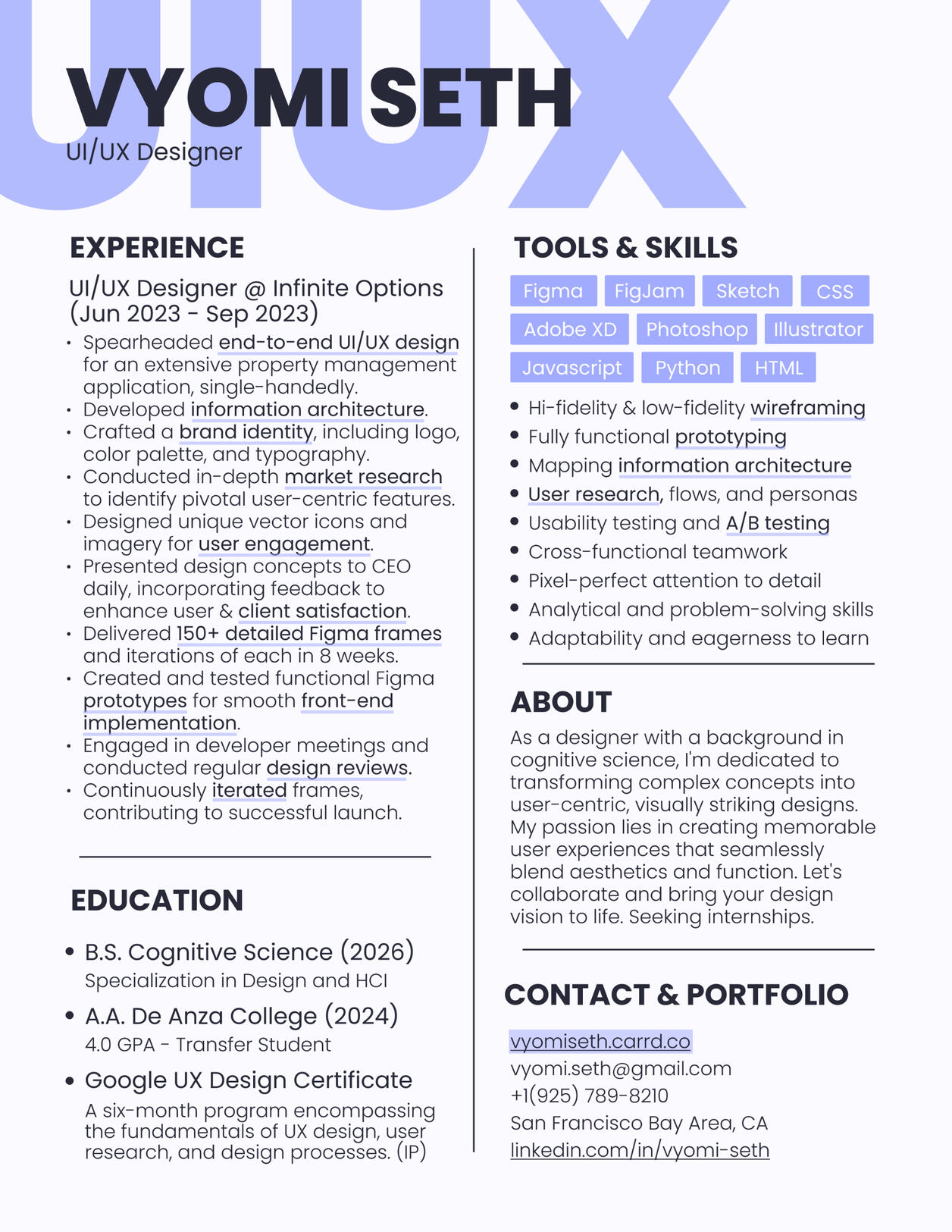
UX DESIGNER
Case Studies
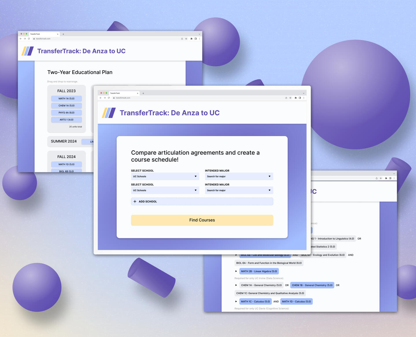
TransferTrack
TransferTrack is a web application developed during a 2-day hackathon event, designed to assist De Anza College transfer students in identifying the classes they need to take to meet major requirements at different UC campuses. The goal was to create an intuitive and easy-to-use tool that simplifies the transfer process.
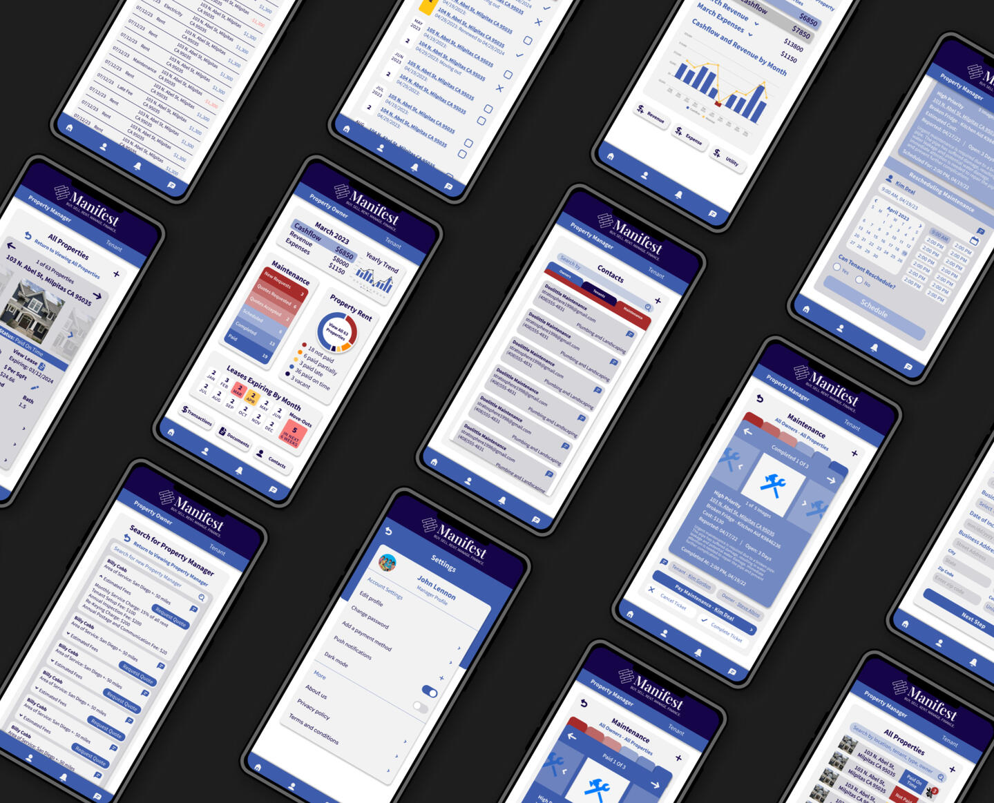
Manifest
Client: Infinite Options
Manifest is a property management app aimed at simplifying the lives of property owners and managers. My mission was to create an intuitive, efficient, and visually appealing platform that could handle the complexities of property management, all while maintaining a user-first approach.
About & Contact

Hi, thank you for taking the time to view my portfolio.I am currently a college student, pursuing a Bachelor's Degree in Cognitive Science with a Specialization in Human-Computer Interaction (a bit of a mouthful, I know). I'm also soon to complete the Google UX Design Certificate, a 6-month course.
I've been fascinated with design and computers for as long as I can remember - it started with making games and vector art on Scratch (a coding community for children) as a kid, to designing logos for my friends' bands during high school.I am really grateful to have the opportunity to pursue UX design as a career. It is really the perfect intersection between art, technology, and psychology - three of my favorite things.Feel free to contact me at [email protected] or connect on LinkedIn. My resume and contact methods are below.
Click on my Resume below
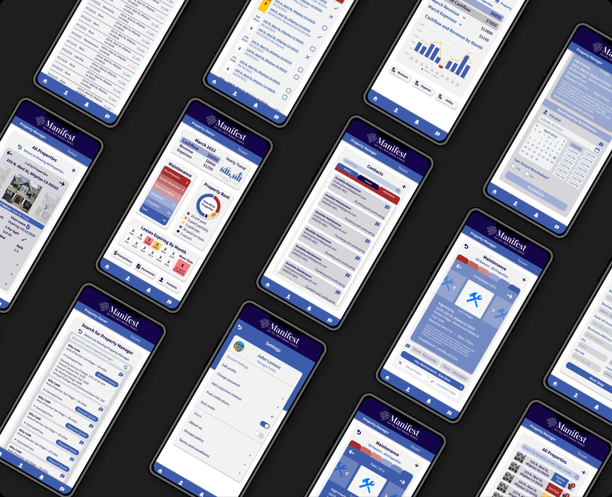
Manifest
My first dive into UX design was Manifest, a dynamic property management app that posed unique challenges and ignited my passion for the field. I was the lead designer for this project. My primary collaborator was the CEO/project manager, a hands-on property owner and manager, who was deeply invested in the design process. During the late stages of design, I also met daily with our team of developers to ensure accurate implementation.
Problem Statement & Pain Points
Despite the seemingly unexciting subject matter, the challenge was compelling: create an engaging, user-friendly platform for property owners, managers, tenants, and maintenance personnel. I faced a multitude of challenges, including:Complexity of Property Management: Property management involves a web of interconnected tasks, from financial data tracking to maintenance requests. The challenge was to simplify these processes while maintaining functionality.
Diverse User Base: Balancing user needs and preferences across a large spectrum of users was an ongoing challenge.
Limited Resources: Operating as a startup, I had to be resourceful and creative due to limited time and budget for research and testing.
Tight Timeframes: I had just eight weeks to design and launch a working prototype. Time management and prioritization became critical.
Competitive Landscape: The property management industry had established players, requiring us to stand out while addressing user pain points.Despite these challenges, I was determined to deliver a property management solution that not only met user needs but was also a competitive product in the industry. Each day, I presented designs, gathered feedback, and refined ideas to ensure the app truly met user needs.In the sections that follow, I'll explore how user research, user personas, competitive analysis, design principles, information architecture, and front-end collaboration shaped Manifest into a transformative property management solution.
User Research & Personas
Understanding our users was critical. I spoke with property owners, managers, maintenance workers, and tenants. The insights gained were invaluable:
The necessity for a mobile app for maintenance workers and managers to use on the go.
A demand for simplicity, especially among users less tech-savvy.
Real-time access to important features: financial data, rent status, and maintenance tickets.
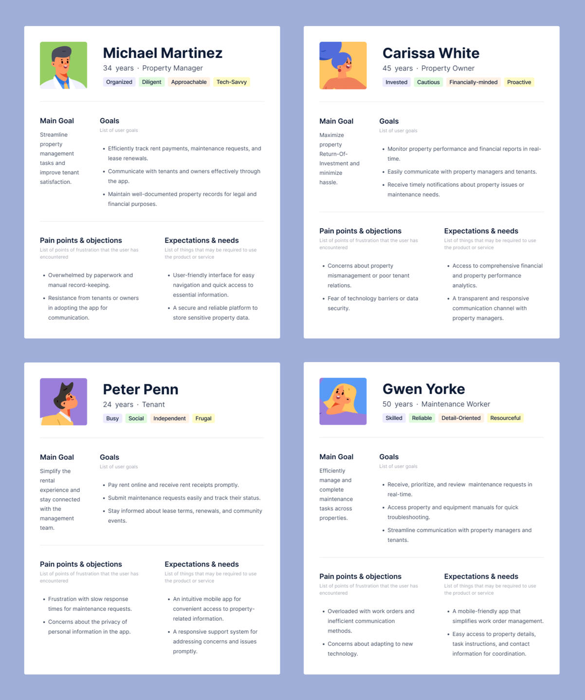
To bring our users to life, I created detailed personas for each role:
Competitive Analysis & Design Principles
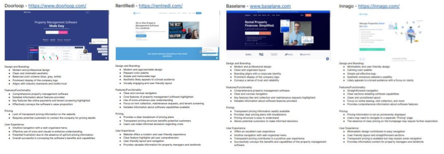
To stay ahead in the property management landscape, I initiated and conducted a competitive analysis of four direct competitors, pictured below.
Usability: Prioritized a user-friendly interface for all stakeholders.
Consistency: Ensured uniformity across features and roles.
Accessibility: Committed to meeting accessibility standards for inclusivity.
Feedback: Incorporated informative feedback mechanisms.
Simplicity: Simplified workflows without sacrificing functionality.
Information Architecture
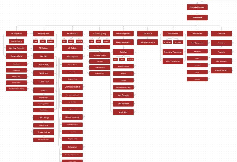
It was very important to me to introduce the concept of information architecture to my team. Mapping out the application's structure was a meticulous process, but necessary for a logical and accessible flow. Pictured below is the information architecture for the property manager dashboard I created.
Design System & Visual and Interaction Design
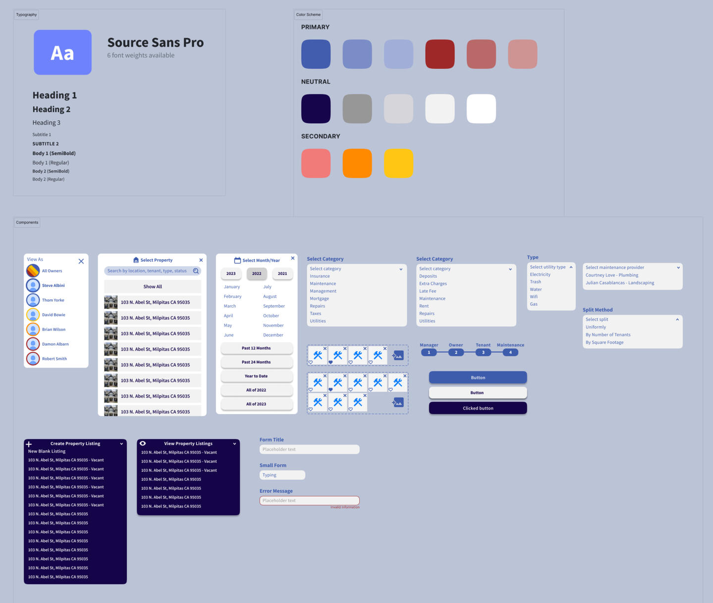
When I introduced a design system, it was a game-changer for the Manifest project. It streamlined our design process, maintained consistency, and accelerated development, ultimately enhancing the user experience. Design system pictured below.
Perfecting the visual identity of Manifest proved to be an iterative journey. I explored countless color schemes, logo designs, and branding elements until we found a look that resonated with the CEO and conveyed professionalism. Pictured below are some of the various logo and branding ideas.
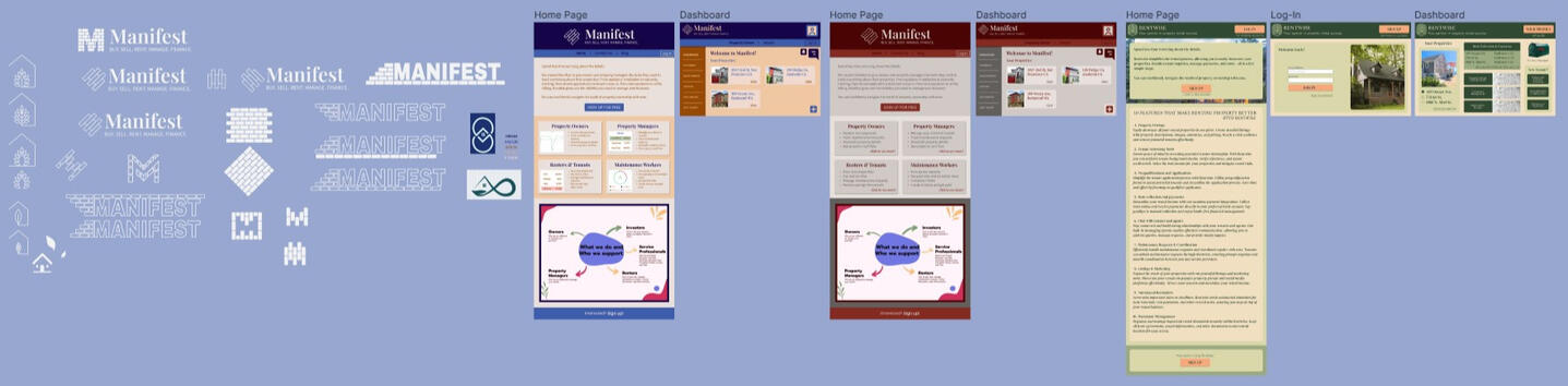
Manifest's complexity presented a unique challenge. With a web of connections between features and roles, I crafted interactions for a high-fidelity prototype to ensure a seamless and intuitive user journey. Pictured below are all some of the connections in the Figma prototyping mode, along with notes for the developers.Linked below is a Figma prototype of the onboarding screens, one of the dozens of flows of Manifest. Due to time restrictions, it was completed in under 2 hours. Try signing up as a new user.